
Overview
Freeela is a dynamic community platform designed to connect users through meaningful exchanges. My role focused UX-led landing page optimisation, shaping how people interact with the product — from the structure of processes to the look and feel of every screen.
Collaborated with product owners and developers to translate product features into customer-facing digital experiences. I designed in Figma with reusable components, design systems, and developer handoff documentation.
At its core, this project was about clarity and intuitive interaction: making complex tasks feel simple, and creating visuals that guide users without overwhelming them. Collaborated with product managers, UX designers, and developers to define and implement innovative UI solutions.


Focus
UX Strategy & Visual Design
Deliverables: Wireframes, User Flows, UI Design
I helped shape Freeela into an intuitive platform for community engagement. Balancing seamless UX with a clean, engaging UI.
UX Focus
-
User Flows
-
Define Persona
-
Form Structure
-
Navigation Design
UI Focus
-
Brand Icons
-
Buttons & Screens
-
Micro interactions

Branding & Visual Identity
* Designed custom icons that communicate meaning at a glance.
* Applied a cohesive visual language across screens using Freeela’s color palette and typography.
UI Components
* Designed buttons, menus, and screens with clarity and hierarchy in mind.
* Ensured UI elements support usability — clear states, intuitive positioning, and accessible touch targets.
Micro-Interactions
Micro-interactions were crafted to make the experience feel responsive and alive.
* Button hover states tailored for feedback and delight
* Subtle transitions to guide attention
* Animated cues to confirm user actions
These micro-moments not only improved usability but also reinforced confidence and engagement.


Design System in ActionThe visual style I developed ensures consistency throughout the product:
Color Palette: Harmonizes brand identity with usability.
Typography: Built around clarity and readability.Icons & Visual Language: Simple, meaningful, and scalable.
Interaction Patterns: Predictable and responsive.
This system makes Freeela pleasant, coherent and easy to understand.
Screens & Highlights
Clear steps, simple language, engaging progress cues.
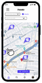
Core Dashboard
Information hierarchy focused on utility and ease of access.
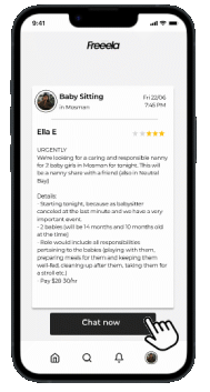
Forms & Actions
Streamlined steps and smart interaction placements.
Micro-Interactions
Responsive feedback that feels intuitive and human.
Reflection
Working on Freeela allowed me to bridge UX strategy and UI expression. I learned how subtle decisions — like where a button sits or how a form progresses — can dramatically improve usability and delight.
The outcome is a product that feels purposeful, accessible, and visually engaging — designed with real user needs in mind.
Explore Freeela: www.freeela.com
